Interiors by Loredana
Say bye-bye to Frozen-themed bedsheets and hello to a kid’s room bursting with function and playful style.
CL: What is your approach to designing a space for children?
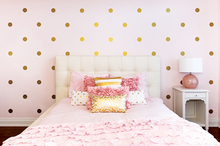
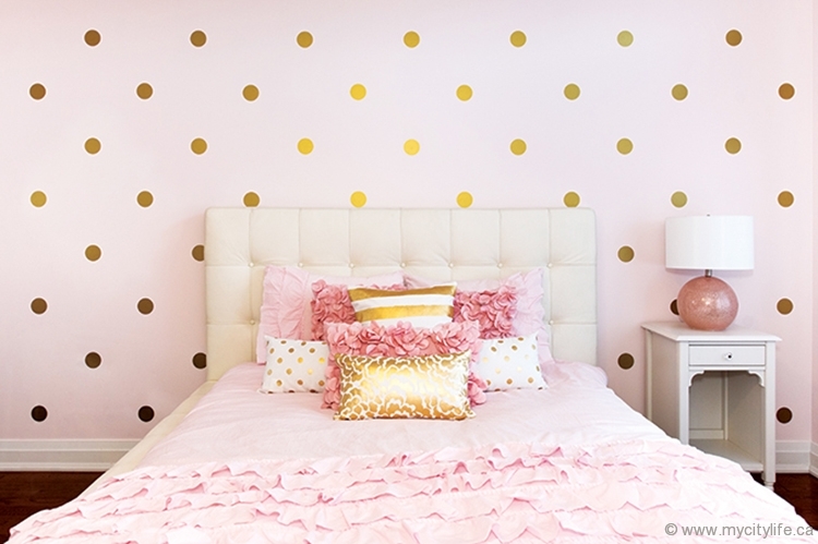
LB: I take my design cues from adult spaces, current trends in the interior design world and classic design principles. For example, gold is making a huge comeback in interior design right now. It’s not necessarily the first colour that comes to mind when you think of a child’s space, but I wanted to incorporate it. The gold adds sophistication, but paired with this lovely soft pink the room is still child-friendly.
CL: Give us an example of a design principle that you followed for this project.
LB: Some rooms already contain a natural focal point, such as a fireplace, an architectural detail or a large window offering a beautiful view. In a space that does not have an existing focal point, you must create one. In this space, the polka-dot feature wall, along with the bed with its large headboard and beautiful pillows, became the focal point of the room.
CL: What’s the biggest mistake people make when decorating a child’s space?
LB: Getting trapped in the mentality that it has to be filled with only “kid-friendly” items. If the space is too babyish or too theme-specific, then you run the risk of your child growing out of it in a couple of years, and this could present you with the problem of having to redecorate the entire room. The overall design of the room should be one that an adult would enjoy as much as a child. You can then add in some personal items or toys that are special to your child.
CL: What are some suggestions for being budget-savvy without compromising style?
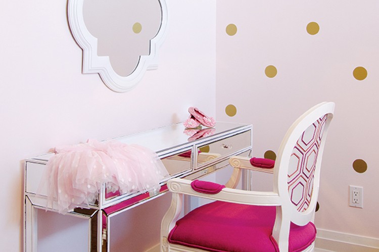
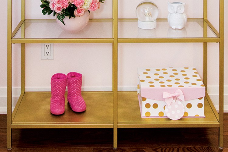
LB: A little DIY can go a long way. When I was sourcing the gold shelving unit, all of the options I found were well above the client’s budget. In the end I suggested a very affordable white metal shelving unit from Ikea that we spray-painted gold. Reusing or repurposing items that you currently own is another great way of keeping the budget on track, which is what we did with the mirrored desk.
CL: What is your favourite element of this room?
LB: In the many spaces that I design, I like to include one unexpected item to add an element of surprise. I love the antique Louis XVI chair and its classic design. The hot-pink fabric also adds a punch of colour to the monochromatic soft pink and gold colour palette.
www.interiorsbyloredana.com
PHOTO BY SILVANA MARSHALL PHOTOGRAPHY



































No Comment